The BRIDGE Chronicles: How We Built a Cleaning Warrior!!

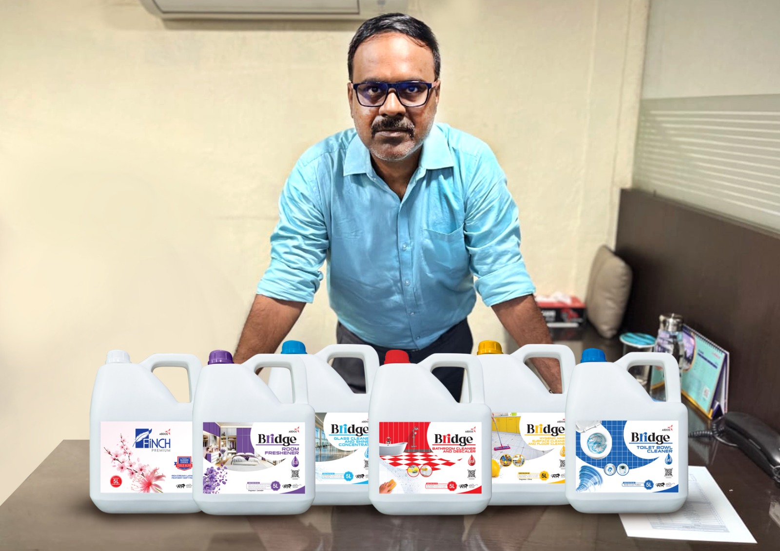
As I spin you the tale of BRIDGE – A brand born from sheer desperation, a dash of madness, and a profound desire to stop institutional floors from resembling abstract art.

The Great Indian Cleaning Conundrum

I’m knee-deep in research for housekeeping, kitchen, and laundry products for institutions – hotels, hospitals, offices, the places where hygiene isn’t a luxury, it’s a lifeline.

The brief seemed simple: Effective. Affordable. Eco-conscious. Staff-friendly. Easy-peasy, lemon-squeezy?

“More like Mission Impossible: Dhaba Edition.”

Things that are coming in my mind are:

“Yes, they had to be hard on stains, tough on germs, and relentless in hygiene performance. But at the same time, I couldn’t ignore the planet, the people who use them daily, and the price sensitivity of the institutional segment.

It should fill the complex gap between performance, sustainability, user safety, and affordability,”

I needed something that didn’t force this impossible choice. Something that… bridged the gap. And just like that, amidst the chaos and questionable cafeteria coffee, BRIDGE was conceived. Not just a name, but a manifesto. A promise to carry the weight of demanding cleaning tasks (like a Mumbai local train at rush hour), withstand the harsh realities (like a Kolkata monsoon), and connect effectiveness with responsibility.

Painting the Town Clean (One Product at a Time)

Now, building a brand identity for a dozen-odd cleaning heroes? Sticking to one colour felt as boring as watching paint dry.

So, I threw the monochrome rulebook out.

Why have one brand colour when you can have a RAINBOW?

We gave each BRIDGE warrior its own vibrant identity, its own story, its own signature shade:

BRIDGE Bathroom Cleaner & Descaler (Crimson RED – #ED1C24): Think of it as the angry, germ-slaying angry young man of the lineup. That RED isn’t just bold; it screams “I terminate limescale and bacteria with extreme prejudice!”

BRIDGE Hygienic Hard Surface & Floor Cleaner (Mikado YELLOW – #FEBC11): Sunshine in a bottle! This bright YELLOW burst onto the scene because, well, our R&D’s first prototype was yellow.

We thought, “Why fight it? Embrace the citrusy cheer!” It’s like that reliable friend who always brings the nimbu pani – refreshing, effective, and leaves everything sparkling clean without the harshness

BRIDGE Glass Cleaner & Shiner Concentrate (Picton BLUE – #1CB3E8): Crystal clear thinking! This serene BLUE mirrors the streak-free shine it delivers. Again, the prototype whispered “blue,” and we listened. It’s the calm, focused yogi of the range, achieving transparency nirvana on every window and mirror. 

BRIDGE Herbal Hygienic Cleaner (Apple GREEN – #51B748): Nature’s own cleaning warrior! The name “Herbal” demanded GREEN – the colour of fresh neem leaves, tulsi plants, and that reassuring feeling of natural power. It cleans deeply and hygienically without the chemical orchestra. 

BRIDGE Room Freshener (Dark LAVENDER – #735096): Ah, the fragrance ambassador! Lavender fragrance? Lavender colour! It was a no-brainer. This deep, soothing LAVENDER doesn’t just mask odours; it banishes them with the grace of a classical dancer, leaving behind a serene atmosphere. 

BRIDGE Toilet Bowl Cleaner (Fun BLUE – #1C63AD): Tackling the toughest job with a surprisingly cheerful vibe! Its deep “Fun Blue” colour came straight from the product itself. It’s powerful where it counts but approaches the task without unnecessary grimness. 

The Masterstroke: The BRIDGE Logo – More Than Just Fancy Letters

Every great brand needs a flag. The BRIDGE logo isn’t just text; it’s an architectural marvel in miniature. Look closely:

  • The R & I: These aren’t just letters; they’re the pillars of our philosophy.

The ‘R‘ stands tall for relentless Research – the deep dives into formulations that actually work.

The ‘I‘ represents our unwavering commitment to Innovation – finding smarter, kinder ways to clean. Together, they literally form the structure of a BRIDGE. Clever, no?

  • The Chameleon Colours: Here’s the genius twist! When a new BRIDGE product enters the world, the colour of the ‘R’ and ‘I’ changes to match its unique identity. Bathroom Cleaner launch? R & I blaze Crimson! Herbal Cleaner debuts? They shimmer Apple Green! It’s like the logo wears the product’s uniform. Instant recognition, zero confusion. Staff spotting the right cleaner from across a crowded storeroom? Hogaya! (Done!)
  • The White Space Wisdom: And the master logo itself? Notice the deliberate white space within the R & I.

This isn’t an accident; it’s a bold declaration. It says:

“BRIDGE doesn’t do rigid. We don’t cling to stereotypes. We are strong, we are reliable, but we are also flexible, adaptable, and ready to evolve with the market’s demands.”

Like a well-designed bridge, we have solid foundations but can sway with the winds of change.

BRIDGE was born from a very real, very messy problem. We didn’t just build a brand; we built a solution.

Our Mission? A Step Ahead Hygiene – & this is our brand tagline

So, the next time you see a fleet of BRIDGE – a crimson soldier battling bathroom grime, a cheerful yellow warrior mopping floors, or a serene blue guardian polishing glass – remember the journey.

Remember the gap we aimed to bridge. We didn’t just create cleaning products; we built a BRIDGE to a cleaner, brighter, more sustainable future for institutional cleaning. One vibrant, powerful, and surprisingly adaptable bottle at a time.

Now, if you’ll excuse me, I need to go appreciate some spotless glass. The BRIDGE way, of course. Shine on!

Leave a Comment